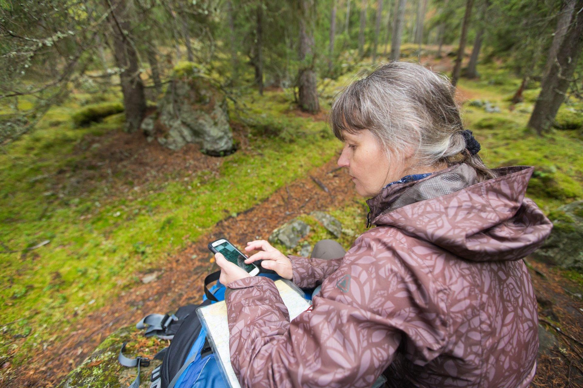
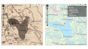
National mapping agencies have long prided themselves on their topographic maps, traditionally printed on paper for use in hiking, exploring, and navigating. However, in recent years, the usage of paper maps has significantly decreased. At the same time, topographic maps have been made more accessible on mobile and web-based applications.
In Finland, the current digital topographic map has undergone minor changes in recent years, but its appearance is still primarily based on styles that were originally optimized for paper maps. As a result, the map can often feel crowded and difficult to read on digital screens. Simply converting the map from its printing format to a digital format does not always produce the most user-friendly results.
From point symbols to clear forest borders
The National Land Survey of Finland (NLS-FI) is currently renewing its topographic database and production system. The ongoing reform of the topographic database presents an opportunity to simultaneously reform the maps, increasing their utility and usability. For example, as the new topographic database will include designated forest areas as features, it enables their presentation in the reformed topographic map.
Despite forest areas comprising a significant portion of landscape in Finland, historically, the extent of forest areas has not been included explicitly in the topographic map. The way the topographic map currently depicts forests is by using point symbols to represent tree types scattered throughout the forested areas. The white background of the map extends to forest areas, and therefore, if an area is not specifically designated as something else it is easily assumed to be covered by forest.
The reformed topographic database allows for the addition of forest areas with clearly delineated borders, providing map users with a more accurate and visually intuitive representation of the extent and location of forested areas. Finland has a wealth of existing data on its forests, including information on the types of trees and growth stages in detailed areas. However, building automated process for producing generalized forest areas from existing data to meet the requirements of the users of the topographic database, will take some time and effort.
The use of green as the primary colour for representing forested areas is an international convention. However, adding a colour to represent forest areas on NLS’s topographic map has a ripple effect on the colours of all the other features depicted in the map. This necessitates rethinking of the entire colour scheme to ensure that all elements are clearly distinguishable and visually cohesive. As part of this work, the semantic relationships between features have been examined, and this will have an impact on how the colours depicting the areas are changed.

Balancing print and screen in map design
Creating a map primarily for digital environment allows cartographers to prioritize the design and functionality for screen display. However, the need for printing cannot be completely ignored, as there are still key customers who rely on map in print. These users appreciate the current version for its usability. Therefore, this version of the map will be refined for printing purposes, in addition to the green forest map designed primarily for the digital environment. The goal is to make these two versions of the map visually as consistent as possible, although colours need to be adjusted to ensure sufficient contrast between features.
In addition to rethinking map styles, the reform of the topographic database and production system includes attention to map data through the scales. The aim is to make the data more suitable for its intended scale by generalizing it more than currently, as it has been found to be overly detailed. The entire generalization process will be improved over the next years. The goal is to increase the level of automation in the process to improve the timeliness of the map data through the scales. Another goal is to define the desired contents and appearance of the map in small scales.
Labels are an essential information carrier in a topographic map. However, text and numbers are never an optimal means of visual communication. In bilingual or densely built-up areas, labels add visual load and become difficult to distinguish. In this work, the information carried by the labels have been critically examined. As a result, many of the current labels will be removed, as some of them are no longer relevant content in today’s topographic map; they may originate from times when other information sources were scarce. Some of the labels will be replaced with map symbols, as in theory, maps should be primarily visual and rely only on minimal text.
User input in the design process
Active involvement of map users and stakeholders in the planning process has been a crucial aspect of this work. To gather input from key users, a feedback group was formed, which was invited to participate in the project. Multiple questionnaires have been administered to this group to gather their insights and feedback. The answers have been taken into consideration throughout the planning process.
In addition, a large questionnaire was created. Its aim was to gather input not only from professional users but also from the public. The questionnaire was distributed through social media and the NLS-FI’s website, and there were over 3,000 respondents providing feedback. The number exceeded expectations.

The proposed change of turning forest areas from white to green received significant feedback, with many expressing concerns about the lack of sufficient contrast in the map. The changes got negative feedback particularly from those who use the map frequently across various platforms. This is understandable, as they represent changes that would require users to re-learn how to read the map. The plans for retaining the parallel version with a white background were not presented to the respondents at this point.
On the other hand, the effort to modernize the topographic map was appreciated by many respondents. The updated map was perceived as fresher and more topical. Furthermore, the survey revealed user needs that were not previously considered. The feedback collected has been a useful contribution in the work. In addition to all of this, the questionnaire revealed that most users really rely on digital map and only use paper maps rarely if at all. However, there are still users, such as hiking enthusiasts, who require a paper map and cannot rely on digital products, for instance when in the wilderness.
Towards a user-focused and flexible topographic map
It is widely acknowledged that vector tile maps represent the future of digital maps due to their scalability, flexibility, and fast loading times compared to traditional raster maps. In line with this, in the future the map styles and the map data will be distributed separately in addition to the map itself. This will provide developers and expert users the opportunity to create customized maps or modify existing ones to meet the specific requirements of their clients. Additionally, users will have access to map data through the scales, enabling them to generate map services across various scales and zoom levels. Throughout this work, one of the most valuable achievements has been the active involvement of key stakeholders in the planning process. By seeking ongoing interaction and input from these stakeholders, the updated topographic map can be developed to better fulfil their needs and those of the broader customer base. This collaborative approach will help to ensure that the map meets the expectations of its users, both now and in the future.


